My Logo’s Evolvement From Ideation to Completion

I started my logo ideation with the chosen name for my brand of Color Encoded. I began with sketching up thumbnails for the 3 kinds of logos (pictorial/symbol, wordmark, and emblem). Here is just a few of my thumbnails.
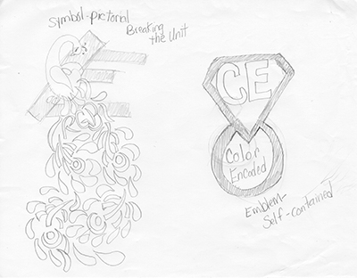
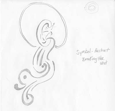
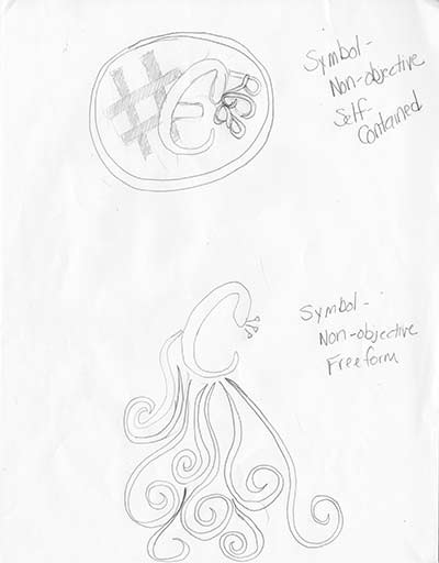
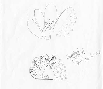
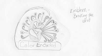
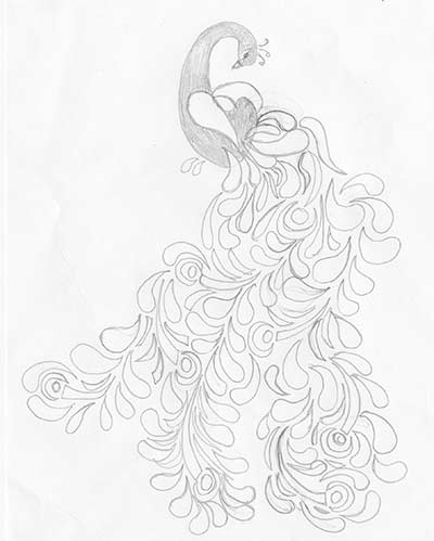
Upon completion of the thumbnail sketching and conceptualizing stage. I arrived at the peacock similar to the last thumbnail shown. But was drawn to the conclusion that the tail was too long for a viable logo. The tail needed to be shortened and tightened up a bit which brought me to the sketched working logo below:
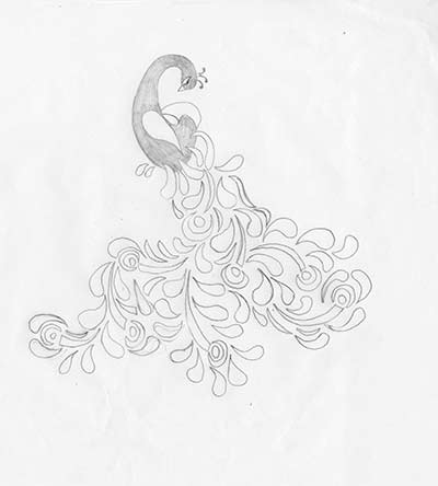
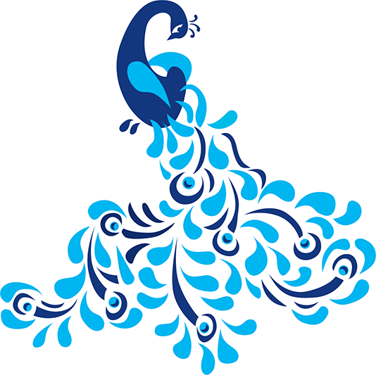
With a working sketch of the logo, I put it in Adobe Illustrator for the template of constructing my logo in Illustrator for a vector logo to be used. I was able to refine and better my pictorial logo of the C peacock.
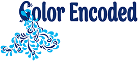
I now had a pictorial logo but know that until my brand is better known due to its presence in the industry it wouldn’t be recognized for Color Encoded alone so I decided to make it part of a wordmark logo but also be able to keep it open to use just the pictorial logo at times as well. So I found a font that resembled the C I used in creating my peacock and used that for the remaining letters in the brand of Color Encoded. Once my logo was created then I had to decide on the colors of my brand. I researched some logos and color choices. One of the popular colors in use is blue and it is a color I favor as well. Upon choosing a color family I knew my color combination had to have a good contrast to have the maximum impact so I chose a dark blue and to offset it I chose a bright and light turquoise blue to compliment it. Having decided on the colors I had completed the creation of my logo for myself as Color Encoded.
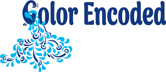
My two colored logo with both the pictorial and wordmark combination
Upon completing my logo I started the process of figuring out the style guide guidelines of my logo and how it would look in both grayscale as well as reversed out. My logo style guide is located here:







Recent Comments